The Skyscraper Museum is devoted to the study of high-rise building, past, present, and future. The Museum explores tall buildings as objects of design, products of technology, sites of construction, investments in real estate, and places of work and residence. This site will look better in a browser that supports web standards, but it is accessible to any browser or Internet device.
br>
BRANDING
Richard Kaplan turned to his friend and classmate from their days at the GSD at Harvard, Ivan Chermayeff, to create a design concept for Heritage Trails. The firm Chermayeff & Geismar, established in 1957, was an award-winning partnership that today describes its aesthetic as having "pioneered the modern movement of idea-driven graphic design across every discipline, specializing in brand identities, exhibitions, print and motion graphics, and art in architecture." In 1995, while Heritage Trails was underway, Jo Ann Lewis wrote a profile on Ivan Chermayeff for the Washington Post, saying, “Something of a collage himself, Chermayeff is half of the world-renowned New York Design firm Chermayeff & Geismar, creators of the exhibitions at Ellis Island’s new visitor center. But the broad range of his work makes him hard to characterize.” Notable among Chermayeff & Geismar’s iconic branding are the logos for Chase Bank, National Geographic, NBC, and PBS.
If it was set from the start that Chermayeff & Geismar would get the job, it was by no means clear what the specific graphic concept would be. Typically, a meeting of a graphic designer and a prospective client would talk about the project’s objectives and audience in a general way that left lots of latitude for creative input. In his letter of July 7, 1994, Ivan Chermayeff reiterated the points of their conversation and offered his ideas and a sense of scope of their services:
When the markers started to come, we started to like this symbol better. When we got on the idea that we could do the 3,000 dots, it [the logo] changed. See, the concept here was that you would see the dot on the floor and then you would see the dot on the marker.
STATIONARY AND BROCHURES
Caption
I believe what is needed is the development of a number of possibilities of several kinds to make the architecture, places of interest, history and wonder within the Lower Manhattan area accessible to tourists from the U.S. and abroad, New Yorkers and the workers and residents of Lower Manhattan itself. Advantage should be taken of the World Trade Center, Ellis Island, Statue of Liberty and the South Street Seaport visitors to expand their horizons. The hotels tours operators and others should be given the tools to communicate to their clients.
And he continued:
Paths and places need to be geared to various audiences, children, foreigners, history buffs, and many others. As I understand it from you, there are 12,000,000 visitors. How they break down can become the starting point for the development of a notebook of ideas to reach out graphically and in other ways, as well.
Chermayeff & Geismar were thus a full-service firm who were charged with working with Kaplan and Peyser to create a brand identity, or a graphic style both consistent and recognizable across the many visual mediums of the project. They worked together to create a brand that would engage the maximum number of people in the rich history of Lower Manhattan through the Heritage Trails logo; the markers, both the stanchions and the layout for the panels; the stationery and brochures; and t-shirts and caps. Chermayeff & Geismar also proposed a design for a visitor center “hub,” but while they did put up temporary visitor centers in Federal Hall and the World Trade Center, a permanent visitor’s center was never realized. Early branding efforts also included a preliminary map before mapmaker Stephan Van Dam took over. In describing the scope of Heritage Trails after a meeting with Richard Kaplan and Nadine Peyser on July 7, 1994, Ivan Chermayeff wrote:
I believe what is needed is the development of a number of possibilities of several kinds to make the architecture, places of interest, history and wonder within the Lower Manhattan area accessible to tourists from the U.S. and abroad, New Yorkers and the workers and residents of Lower Manhattan itself. Advantage should be taken of the World Trade Center, Ellis Island, Statue of Liberty and the South Street Seaport visitors to expand their horizons. The hotels tours operators and others should be given the tools to communicate to their clients.
The goal of Heritage Trails was to aim branding efforts at the specific demographics of Lower Manhattan. Chermayeff continued: “paths and places need to be geared to various audiences, children, foreigners, history buffs, and many others. As I understand it from you, there are 12,000,000 visitors. How they break down can become the starting point for the development of a notebook of ideas to reach out graphically and in other ways, as well.”
In this letter, Chermayeff proposed that his firm begin a presentation that would “also be developed in practical terms, with costs and maintenance considerations as an integral part of the project,” and would, if started in August, be ready to be presented to “key individuals and organizations involved in Lower Manhattan” by October. He estimated the cost of hiring the firm at $30,000 with an additional $5,000 for other expenses.
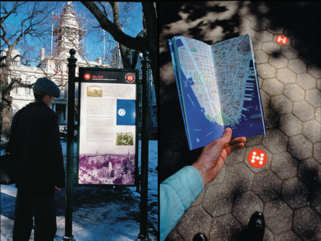
Keith Helmetag, who then worked at Chermayeff & Geismar and is now a founding member of C&G Partners, was the principal graphic designer for Heritage Trails. He specializes in sign and way-finding, and within the branding efforts, he was the driving force behind taking a more historic approach, largely inspired by an old photograph he from the late 1800s including an advertising stanchion. The brand went through many changes as the design team began to favor some ideas over others.
LOGOS

Helmetag explained that the HT logo evolved. Initially, the logo consisted of the word “Heritage Trails” surrounded by winding dots in the colors of the various trails. Over time, however, Chermayeff & Geismar came to prefer the design of a single dot with an H in it.
Helmetag explained that the “H” logo was inspired by the street markers the team planned on laying down. He said:
While earlier drafts of the site markers displayed the strung-out logo, later renditions used the “H” logo. In addition to the “H” logo’s relationship with the street markers, another reason for the change was that it shifted the focus of the marker from Heritage Trails to the site in question. Helmetag explained:
In this version, the site is sublimated to the trail, and in this version the site comes to the foreground, and it really is irrelevant that it’s Heritage Trails. Somewhere it’s on there. At that point, we were probably moving to the circles because we had 3,000 dots. So we had the H with the dots.
DESIGN OF THE MARKERS
Like the logo, the design for the street markers changed. Originally, Chermayeff & Geismar conceived of a more modern stanchion that would be painted to match the color of the trail. However, when Keith came across historic photographs of downtown Manhattan in the late 1800s, he noticed an advertising stanchion that he thought would work well for Heritage Tails. After calling around, he determined that the stanchions had been made by Robinson Iron in Birmingham, Alabama and that they still had the molds. Keith explained:
I convinced Ivan under some duress, because he’s a modernist, and I convinced Richard quickly that it would be not only correct to do the original markers, but then there were also the frames, which they didn’t have.
Keith initially wanted to do the markers in porcelain enamel, but this was never realized. He said:
The original idea what that these were going to be done in four-colored porcelain enamel, but as one knows, the lead- time of four color porcelain enamel is extraordinary, and the cost is at least 50 times, if not more, than the digital… I think the concept, at least from the designer’s point of view, was always that eventually it was gonna be done in porcelain enamel. But scotch print was gaining a lot of traction as an alternative to porcelain enamel.
Early markers were designed with black backgrounds, but Chermayeff and Geismar ultimately made the background beige. Keith believes that the beige background is softer and less severe than the black, and that it invites people to look at it more. He says about the beige backgrounds: “they were lighter, they were more welcoming.”
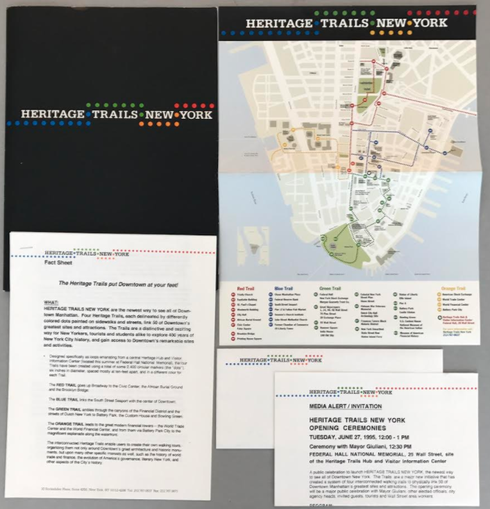
The first Heritage Trails brochure was unveiled on June 27, 1995, two years before the site markers went up. Nadine explained the purpose of the 1995 brochure:
This whole look and feel came from the Eyewitness guide. So Eyewitness was a great visitors guide that we looked at as an example of what we thought was very cool. And it was the first guide to really use this kind of imagery or icons with text. So we decided for our map brochure that we wanted to create some sort of visual connection or icon so people could correlate between what they were seeing, what they were looking at, something to find.
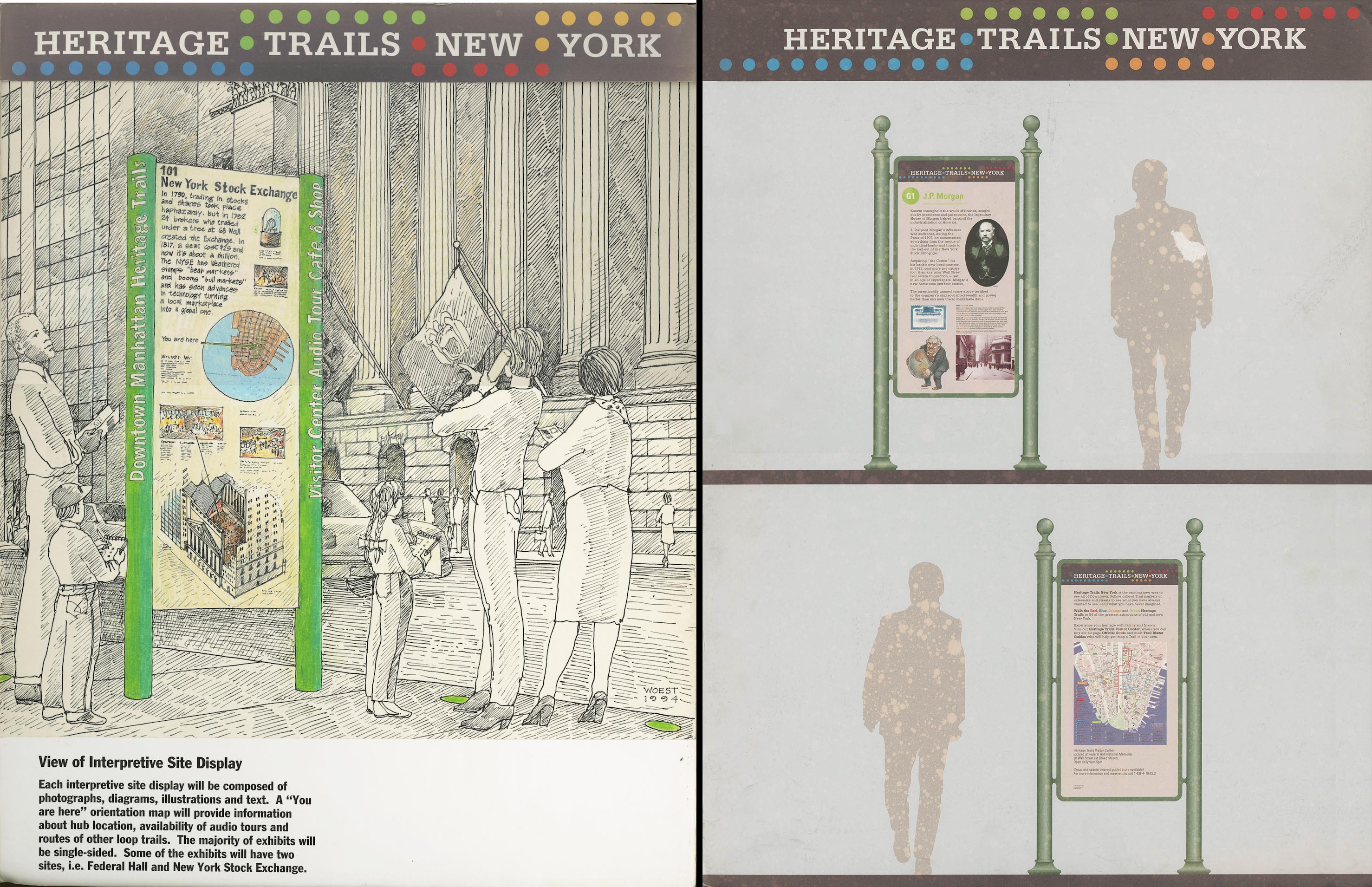
In their October 1994 proposal, Chermayeff & Geismar envisioned a visitor hub for Heritage Trails. The illustrations of the interior and exterior of the hub were done by Kevin Woest for. Keith explained:
What this picture is alluding to is essentially a mini version of what John and I were working on at Queens, which was a walkover map, and then a series of interactive stations that would allow you to interact with the map, much like Chermayeff and Geismar had done a long time ago, previous to this, at the Hancock Observatory. This was envisioned as an interactive light show pounced onto a dimensional map of the scale of the panoramic view.
The purpose of the proposed hub, according to Nadine, was to bring “people to a center, and then allowing them to get to know the Trails, not unlike your museum, a sense of the city before they go out into it. So that was the original thinking around Federal Hall, obviously being this wonderful historic site.” The permanent hub was never built, but there were two temporary exhibits at Federal Hall and the World Trade Center. Keith called the one at Federal Hall “more robust” than the one at the World Trade Center, which went down with the building.
Chermayeff & Geismar designed an early version of the map that they brought before the Art Commission on May 8, 1995. Helmetag said, “we had to get moving so we needed to chart where the trails were and we needed to go before the city and get the thing moving.” When asked how exactly they put together the map, he said:
I think that it was at a cruder time. If this was today you would get this from google earth and then you would snap it down. You would strip away things. In this instance, I think we just did probably much the same. We had a map, the most current map we could get. We scanned it, we drew it, and we got here.
The early version was updated by Stephan Van Dam and was first unveiled on June 27, 1995, when Heritage Trails celebrated their launch.